Bibliothèque de boites de jeux Nintendo
Pour consoles NES, SNES, N64, G&W, GB, VB, GBC et GBA
Embellir gratuitement sa collection de jeux en loose
Sauvegarder le patrimoine vidéo ludique
Participer au projet en envoyant des scans de boites ou des retouches
Témoignages de soutien au site NintAndBox

-
- A lire avant de poster
-
-
La foire aux questions
Avant de poser votre question sur le forum, assurez-vous que la réponse n'existe pas déjà dans l'une de nos FAQ !
-
La foire aux questions
Your thoughts about this restoration
8 message(s)
• Page 1 sur 1
Your thoughts about this restoration
![]() par Martwansito » 23 Juillet 2018, 04:22
par Martwansito » 23 Juillet 2018, 04:22
I would want to know if this restoration matches the site criteria.
What should I improve?
What is ok?
What is unacceptable?
NOTE: I used the art from the european version to complete some parts that were missing because of the scan (see left side)
What should I improve?
What is ok?
What is unacceptable?
NOTE: I used the art from the european version to complete some parts that were missing because of the scan (see left side)
- Martwansito
- Message(s) : 62
- Inscription : 08 Avril 2017, 01:44
- Localisation : Spain
Re: Your thoughts about this restoration
![]() par Sjaaks » 23 Juillet 2018, 09:51
par Sjaaks » 23 Juillet 2018, 09:51
Hi Martwansito,
First of all, thank you for contributing and attempting a restore of a box. It is very much appreciated. Could you please upload the box in the Drop Files Zone (no compression, please save the file in the highest quality possible), preferrably the PSD file instead of the JPG. Then i'll have a close look in Photoshop with the original scan in the background to see if the quality matches our criteria.
Thanks very much in advance,
regards,
Sjaaks
-

Sjaaks - Message(s) : 57
- Inscription : 11 Octobre 2014, 11:18
Re: Your thoughts about this restoration
![]() par Martwansito » 25 Juillet 2018, 00:51
par Martwansito » 25 Juillet 2018, 00:51
Of course mate.
I've uploaded the JPG with no compression in the Drop-Files-Zone.
Also, you can find and download the PSD file here:
https://www.dropbox.com/sh/o9lm3kditmlh ... 3hlga?dl=0
I tried to organize all the layers so it can be easily understandable. Just take a look and tell me what you think, please
I've uploaded the JPG with no compression in the Drop-Files-Zone.
Also, you can find and download the PSD file here:
https://www.dropbox.com/sh/o9lm3kditmlh ... 3hlga?dl=0
I tried to organize all the layers so it can be easily understandable. Just take a look and tell me what you think, please
- Martwansito
- Message(s) : 62
- Inscription : 08 Avril 2017, 01:44
- Localisation : Spain
Re: Your thoughts about this restoration
![]() par Sjaaks » 25 Juillet 2018, 09:39
par Sjaaks » 25 Juillet 2018, 09:39
Hi!
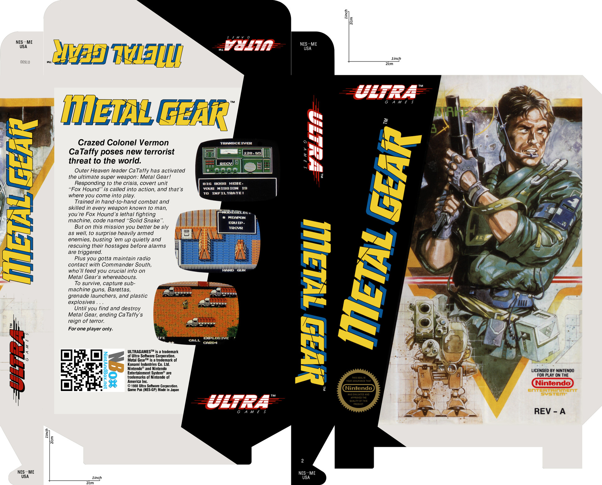
Thanks for providing me the files. So i've taken a closer look. It looks very promising, really nice! There are a couple of minor issues that need to be fixed before it's ready to publish. If you would take care of these, i would be much abliged!
Front
- The text in the Seal of Quality should be Helvetica Condensed Bold or Helvetica Narrow Bold, it's too thin now.
- In the lower right corner i can still see the old Nintendo Logo underneath the new one. Please clean away the old logo so it's not visible anymore.
- The same also goes for the "ENTERTAINMENT SYSTEM" logo, please clean away the old logo underneath it.
- The illustration is okay, but i can see you blurred away the printing grid. You did it in a subtle fashion, so it's okay like this, but barely. Personally i prefer to not blur the printing grid on illustrations, because if you look closely on the original box, the printing grid is visible as well, so it's only natural for it to be there.
Back
- The Metal Gear logo/illustration on the side is not aligned properly, it should be aligned a bit upwards and to the left.
Thank you very much in advance!
Regards,
Sjaaks
-
Sjaaks - Message(s) : 57
- Inscription : 11 Octobre 2014, 11:18
Re: Your thoughts about this restoration
![]() par Martwansito » 30 Juillet 2018, 03:44
par Martwansito » 30 Juillet 2018, 03:44
I'm currently working in those improvements, will need a few days to finish it!
- Martwansito
- Message(s) : 62
- Inscription : 08 Avril 2017, 01:44
- Localisation : Spain
Re: Your thoughts about this restoration
![]() par Martwansito » 06 Septembre 2018, 04:36
par Martwansito » 06 Septembre 2018, 04:36
Hey! Time passed fast, didn't have much time lately.
I tried to solve all the problems you found. I did my best with the grill problem, reinforcing it a little bit,
as you can see here:

Check it out by yourself...
https://www.dropbox.com/s/9j8z3wr5uqb7z ... 9.png?dl=0
I tried to solve all the problems you found. I did my best with the grill problem, reinforcing it a little bit,
as you can see here:
Check it out by yourself...
https://www.dropbox.com/s/9j8z3wr5uqb7z ... 9.png?dl=0
- Martwansito
- Message(s) : 62
- Inscription : 08 Avril 2017, 01:44
- Localisation : Spain
Re: Your thoughts about this restoration
![]() par Sjaaks » 06 Septembre 2018, 08:08
par Sjaaks » 06 Septembre 2018, 08:08
Hi!
The front of the box is excellent now. The Metal Gear logo on the back was still not aligned correctly, but i took the liberty of fixing that myself. I'll publish your box today!
Thank you very much for contributing, you did an outstandig restore of the Metal Gear box and we can use all the help we can get!
Regards, on behalf of NintAndBox.net
Sjaaks
-
Sjaaks - Message(s) : 57
- Inscription : 11 Octobre 2014, 11:18
Re: Your thoughts about this restoration
![]() par Martwansito » 06 Septembre 2018, 17:54
par Martwansito » 06 Septembre 2018, 17:54
I forgot about that 
Thanks, I hope many people enjoy the result and use it to enhace their collections or doing creative stuff. I'll be here doing more things, contributing, helping and learning! I recently acquired a drawing tablet with screen and I think this will allow me to do faster and better restorations.
Thanks, I hope many people enjoy the result and use it to enhace their collections or doing creative stuff. I'll be here doing more things, contributing, helping and learning! I recently acquired a drawing tablet with screen and I think this will allow me to do faster and better restorations.
- Martwansito
- Message(s) : 62
- Inscription : 08 Avril 2017, 01:44
- Localisation : Spain
8 message(s)
• Page 1 sur 1
Qui est en ligne ?
Utilisateur(s) parcourant ce forum : Aucun utilisateur inscrit et 79 invité(s)